
The Best Fonts for Foil Quill (and How to Use Them)
June 30, 2026 · Updated July 11, 2026
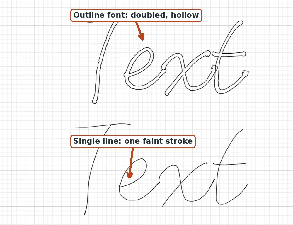
The foil quill only looks good with single line fonts, full stop. Use one and the foil lays down in crisp, shiny strokes that look hand-lettered in gold; use a normal font and you get doubled, hollow letters with patchy foil in between. Here is exactly what to use, what to avoid, the two different foil tools people mix up, the full Design Space setup, and a troubleshooting table for when foil misbehaves.
TL;DR
- Foil quills follow a line, so they need a true single line font (also called a writing or sketch font), not a normal cut font.
- Best looks: monoline script, clean single-line print, your own handwriting, or a favorite font converted to single-line.
- The heated Foil Quill (We R Memory Keepers) and the pressure-based Cricut Foil Transfer System are two different tools. Both still need single-line designs.
- Set the layer Operation to Draw for the heated quill, Attach it, put the shiny side up, tape the foil drum-tight, and let the tip heat fully.
- Faint result? Run a second pass without unloading the mat. Once you unload, you lose alignment for good.
The rule: single line fonts only
A foil quill is a heated tip that follows a line, pressing foil onto the paper wherever it travels. It cannot fill shapes; it can only draw paths. A normal outline font hands it the two edges of each letter, so the quill traces around every letter and leaves a hollow, doubled result. Worse, because those two passes sit close together, heat bleeds between them and the foil blotches.
A single line font stores each letter as one stroke, so the quill makes one clean, evenly heated pass per stroke. That single pass is why foiled single-line lettering looks like hand lettering with a gold pen. If single line fonts are new to you, the plain-English explainer covers them in two minutes, and why is my Cricut writing in bubble letters shows the exact outline-vs-single-line difference on screen.
Foil Quill vs Cricut Foil Transfer System
This is the mix-up that ruins the most projects, so let us clear it up first. There are two popular ways to get a foiled line, and they are not interchangeable.
The Foil Quill by We R Memory Keepers is a heated tip. It warms up, you draw over a sheet of heat-activated foil, and the heat transfers the color onto the paper below. The Cricut Foil Transfer System is a pressure tool: it debosses the foil into the paper with no heat at all, and it has its own dedicated Foil operation built into Design Space.
| Feature | Foil Quill (We R Memory Keepers) | Cricut Foil Transfer System |
|---|---|---|
| How it works | Heat melts foil onto paper | Pressure debosses foil into paper |
| Warm-up | About 5 minutes | None |
| External power | Yes, USB powered | No |
| Design Space Operation | Draw (Pen) | Foil (Fine / Medium / Bold) |
| Foil it uses | Heat-activated craft foil | Cricut Foil Transfer Sheets |
| Tip sizes | Fine, Standard, Bold | Fine, Medium, Bold |
| Warranty note | Third-party tool, not an official Cricut accessory | First-party, fully supported |
The important thing for fonts: both tools follow a line and neither can fill a shape, so both need single-line designs no matter which one you own. The heat side just makes the single-line rule stricter, because two close passes do not only look doubled, they also let heat pool and blotch.
What looks best in foil
- Monoline script. Flowing connected letters, one stroke wide, are the classic wedding-invitation foil look. Elegant on place cards, vow books, and gift tags.
- Single line print. Clean upright letters for labels, tags, quotes, and anything that needs to stay readable at small sizes.
- Your own handwriting. Draw your alphabet once in the handwriting font generator and foil gifts in your actual hand. For anything personal, nothing beats it.
- A favorite font, converted. If the invitation suite already uses a specific font, run it through the font to single line converter and the foiled text matches the printed text, stroke for stroke. Conversion quality varies with the source font, so clean monoline and script fonts convert best.
Here is how the common font styles actually behave under a foil tip:
| Font style | Foils well? | Best use |
|---|---|---|
| Monoline script | Yes | Wedding invitations, place cards |
| Single-line print | Yes | Small labels, tags, quotes |
| Your handwriting | Yes | Personal gifts, cards |
| Converted favorite | Yes | Matching a printed suite |
| Thick display | No | Cut or print instead |
| High-contrast serif | No | Cut or print instead |
| Filled flourish font | No | Cut or print instead |
Avoid thick display fonts, high-contrast serifs (thick stems with thin hairlines), and fonts full of filled flourishes. Those are made to be cut or printed. Reduced to a single foil line, thick areas cannot fill and hairlines barely register, so the result reads as neither one thing nor the other. Our foil quill fonts page and the free single line fonts collection both have ready-to-use options if you want to skip the hunting, and fonts that write, not cut explains how to tell a real writing font from a lookalike.
Match the tip to your lettering
The heated Foil Quill ships with a few tip sizes, and matching the tip to the weight of your font is the difference between crisp and mushy. The sizes below are the widely reported figures and may vary with product revisions.
| Tip | Size (reported) | Best for |
|---|---|---|
| Fine | 0.5 mm | Small text, delicate script |
| Standard | 1.5 mm | Most designs |
| Bold | 2.5 mm | Thick strokes, large lettering |
Rule of thumb: use the fine tip for small or thin lettering and the bold tip for large display strokes. A fine word run with the bold tip smears; a big title run with the fine tip looks thin and takes forever.
Install and set up in Design Space
Design Space and Silhouette Studio only see fonts installed on your computer (the System filter).
- Download the font, then install the .ttf or .otf: right-click and choose Install (on Mac, double-click, then Install Font).
- Fully close the app and reopen it so it reloads your fonts. This is the step everyone misses; the bubble-letters guide has the full font-troubleshooting list.
- In the font menu, switch the filter to System and search the font name.
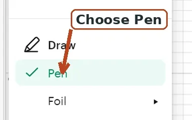
- Set the layer Operation to Draw (Pen). The quill behaves like a pen as far as the software cares. If you own the Cricut Foil Transfer System instead, set the Operation to Foil and pick Fine, Medium, or Bold. (Cricut renamed "Linetype" to "Operation," so menu names may shift with updates.)
- Attach the text to your base shape in the Layers panel so it foils exactly where you placed it. The full walkthrough lives in how to use single line fonts in Cricut Design Space.
Loading the heated quill on a Cricut. The kit includes machine adapters, commonly labeled A (Silhouette), B (Brother), C (Cricut), and D (Sizzix). Attach the C adapter for Cricut and drop the quill into the pen clamp (accessory holder). Give it its warm-up before you load foil, and keep the included heat shield or protective plate under the tip during warm-up so the heat does not damage the machine or mat. One honest heads-up: the Foil Quill is a third-party tool, not an official Cricut accessory, so some crafters point out that running non-Cricut tools can affect your machine's warranty. It is worth checking Cricut's current warranty terms yourself before you commit. The Cricut Foil Transfer System is first-party, so it does not raise that question.
Prefer not to install a font at all? Cricut Access fonts include a Writing style. Select the font, open the font filter, tick Writing to show only writing-capable fonts, then set the Style dropdown to Writing to get the single-line version. It is a handy shortcut, but not every "writing" style is a flawless single line, so for full control over spacing and shape a true single-line or converted font is still the reliable path. More on that in how to write with a Cricut pen.
Foil technique that saves projects
- Buy the right foil. The heated quill needs heat-activated foil only (We R Memory Keepers and similar craft heat foils). Toner or laminator foil (the Minc style) and adhesive or cold foils will not transfer with the heated tip. The Cricut Foil Transfer System is the opposite: it needs Cricut Foil Transfer Sheets and does not use heat foil.
- Shiny side up. Lay the foil colored, shiny side facing up. The heated tip presses down from the top onto the matte back and transfers the color down onto the paper below.
- Heat fully first. Give the quill its full warm-up (about five minutes) with the heat shield under the tip before the first letter, or openings come out faint.
- Tape the foil drum-tight. Foil must be smooth and taut with no lumps, bumps, or wrinkles, the number one cause of skips. Secure it with low-tack washi or painter's tape and smooth it flat with a finger or a brayer. Keep the foil from touching the sticky mat, which ruins the mat's tack.
- Size up for small text. Heat needs a moment of dwell time to transfer, so tiny letters foil patchy. If a small word struggles, make it about 20 percent bigger before touching any settings (a rule of thumb, not a hard spec).
- Slow down on glossy stock. Coated and glossy papers need more dwell time. Slower speed gives the foil time to bond. On Silhouette, some crafters report a speed around 3 to 4 and lower force look shinier on cardstock, but those are one person's numbers on one machine, so treat them as a starting point.
- Pick a smooth surface. Best results come from smooth, untreated stock: plain and textured cardstock, paper, vellum, acetate, book board, leather or leatherette, and wood. Heavily textured stock foils unevenly because the tip only touches the raised ridges.
- Do a test tag. One scrap test with your exact foil and paper answers every "will it work" question in thirty seconds, and it beats any setting someone else swears by.
The most useful fix nobody tells you: if the first pass looks faint, you can run it again, but only if you do not unload the mat. Let the whole project finish, leave the mat loaded, lay fresh foil over the spot, and press the flashing Go button to run it a second time. Once you unload the mat, you cannot realign a second pass, so decide before you touch that unload button.
Troubleshooting
| Symptom | Likely cause | Fix |
|---|---|---|
| Doubled or hollow letters | Regular outline font | Switch to a true single-line font, or set a Cricut Access font's Style to Writing |
| Faint or patchy foil | Tip not fully heated, or speed too fast | Let it heat the full time, slow the machine, run a second pass without unloading the mat |
| Skips and gaps | Foil not smooth and taut | Re-tape drum-tight and smooth it with a finger or brayer |
| Tearing | Foil lifting or the tip snagging a ridge | Re-tape tighter and switch to smoother stock |
| Weak finish on a long job | Tip losing heat on a cold day | Pause a minute mid-job to let it recover |
| Small text will not transfer | Strokes move under the tip too fast to bond | Size up about 20 percent, slow down, or use a heavier tip |
| Foil sticking to the mat | Foil overhanging onto the sticky mat | Keep foil off the mat; tape only over the design area |
Frequently asked questions
Do you need single line fonts for the foil quill?
Yes. The tip can only follow a line, not fill a shape, so it needs a font stored as one stroke per letter. A normal font gives it two edges and comes out hollow and doubled. See what is a single line font for the two-minute version.
Why is my foil quill drawing double or outlined letters?
You are using a regular outline font, so the tip is tracing both edges of every letter. Switch to a true single line font, or if it is a Cricut Access font, set its Style dropdown to Writing.
Is the Foil Quill the same as the Cricut Foil Transfer Kit?
No. The Foil Quill (We R Memory Keepers) is heated, needs about a five-minute warm-up, uses USB power, and uses heat-activated foil. The Cricut Foil Transfer System uses pressure to deboss the foil, needs no heat or power, has its own Foil operation in Design Space, and uses Cricut Foil Transfer Sheets. Both still require single-line designs.
Which side of the foil goes up?
The colored, shiny side faces up. The heated tip presses down from the top onto the matte back and transfers the color down onto the paper below. Cricut Foil Transfer Sheets also go colored side up.
Why is my foil faint, patchy, or skipping?
Usually the tip is not fully heated, the foil is not smooth and taut, the speed is too fast, or the paper is textured. Let it heat the full time, smooth and tape the foil flat, slow down, and if needed run a second pass without unloading the mat.
Can I convert a regular font to use with the foil quill?
Yes. Run the OTF or TTF through the font to single line converter to get a centerline version that keeps the original spacing, then install and foil it like any other single-line font. Quality depends on the source font, so clean monoline and script fonts convert cleanest.
What foil works with the foil quill?
Heat-activated foil only, such as We R Memory Keepers and similar craft heat foils. Toner or laminator foil (Minc style) and adhesive or cold foils will not transfer with the heated tip.
The short version
Pick a true single line font (monoline script or clean print, or your own handwriting), set the Operation to Draw, tape the foil shiny side up and drum-tight, let the quill fully heat, and test on scrap once. Browse the font library or the free single line fonts for Cricut roundup if you need a starting set. Foil rewards that small amount of patience with the shiniest thing your machine can make.
Try it while you're here
Your words in real fonts made from real handwriting with this tool.
Loading fonts…
Foil cleanly with single line fonts made for the quill.
Get single line fonts for foil quillFree to try, no account needed. Pay only when you keep a font.